
Design & Layout
Position panels for impact
- Avoid placing panels across the centre of a double-page spread, as this will split when viewed in single-page mode on a mobile device.
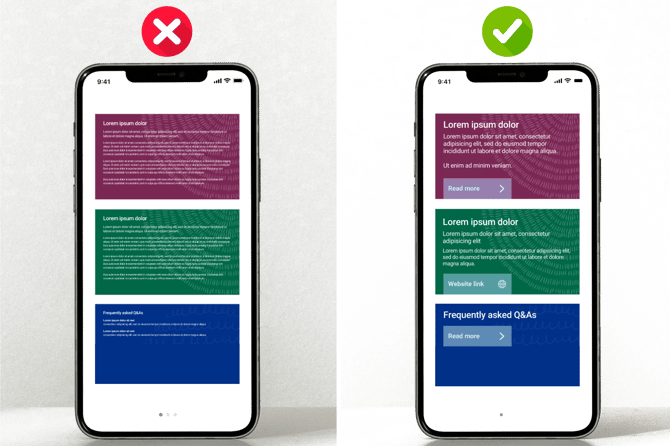
- Ensure panels stack vertically and flow naturally.
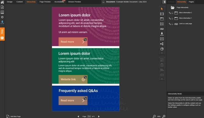
- Ensure clickable areas such as buttons and links are large enough to tap.
- Leave plenty of spacing between clickable areas to avoid accidental taps.
- Mobile users scan rather than read, so make key information easy to spot.
- Multi-column layouts don’t work well on smaller screens - a stacked, single-column design ensures content flows naturally on mobile.
- Consider adding a contents page for long documents.
Text
Small screen, big results
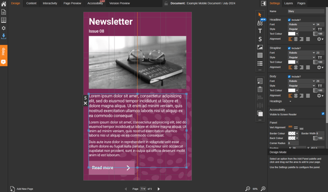
- Use a Heading and Body formatting in More Information pop-up boxes.
- Ensure text is large enough to prevent readers needing to zoom in to read.
- Avoid giant headings on mobile - they can crowd the screen.
Line height and spacing matters!
- Use sufficient line spacing to keep text easy to read.
- Add plenty of margin between blocks of text so it doesn't feel cramped.
- Keep paragraphs short (2–3 sentences max).
Stick to web-safe, readable fonts
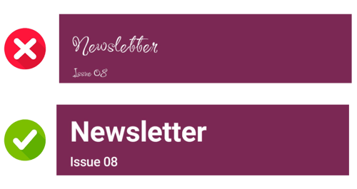
- Choose clean, sans-serif fonts like Arial, Roboto, Open Sans, or Helvetica.
- Avoid decorative or script fonts on mobile - they’re hard to read at small sizes.
Avoid all-caps and long paragraphs
- ALL-CAPS IS HARD TO READ ON SMALL SCREENS.
- Break content into short, scannable chunks with clear headings.
Consider panel position and type
- Use multiple Text or Story panels to separate content visually.
- Always use Text or Story panels for written content, not text saved in an image.
Images & Videos
Portrait vs Landscape
-
AI-generated videos can be created in portrait (9:16) as well as landscape (16:9), making them a better fit for mobile screens and narrow embedded panels.
Portrait videos match how people naturally hold their phones, making them ideal for social and mobile-first platforms. This more native viewing experience helps increase engagement rates and suits on-the-go viewing.
Use images effectively
- Avoid full-page background images or large decorative visuals that don’t add value.
- Text in images won’t scale well, can't be readable by screen readers, and might appear blurry on small screens.
- When using an Image Gallery module, set captions to 'Toggleable' so they don’t interfere with the image.
Document Style
Choose mobile-friendly Style settings
- Set ‘Single Page Stretch to Fit’ to ‘Stretch to Width and Height’ for full-page responsiveness.
-
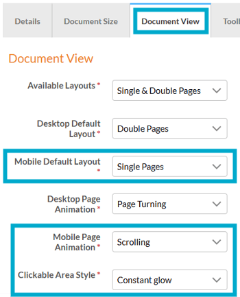
In mobile view settings, select ‘Single Pages’ and choose ‘Scrolling’ as the page animation for a smoother experience.
-
Set ‘Zoom Magnification’ to x2.0 to allow readers to pinch and zoom while viewing a document

Some devices support pinch and zoom without the 'Zoom Magnification' setting applied, but it is advisable to enable it to ensure the feature works for all readers.
-
Make sure the clickable area is set to display, so readers can easily see where to tap for interactivity.
- Position the toolbar at the bottom if you plan to include a menu in your document, as menus will display at the top.
Testing
Make testing part of your process
- Test on real devices, such as a mobile phone or tablet.
- Simulators are good, but real devices (especially different screen sizes) will show you true usability.
- Check for readability, spacing, and clickable areas.