
Components let you add pre-configured, on-brand panels to a Fully Editable page in seconds. Choose a ready-made page design or add individual components, then customise the content and settings without configuring every panel option manually.
- Drop ready-made, branded panels onto any Fully Editable page.
- Every panel is added already matched to your branding.
- Any component can be resized or detached, giving you full creative control.
Overview
If the Layout Library feels too restrictive, but starting from a blank Fully Editable page feels too time-consuming, Components sit in between. Every page design in the Layout Library has been rebuilt using Components, so you get the same polished layouts with full control to customise them afterwards.
How to use Components
Option 1: Start a page from a component-built layout
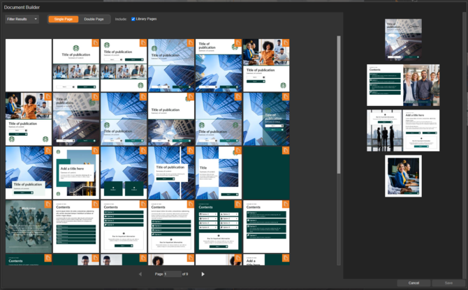
Choose from a set of ready-made page designs and drop them straight into a document.
-
Select 'Add New Page' in an existing Fully Editable design.
-
In the Document Builder, use the filter to find the type of page needed.
-
Click and drag the chosen page(s) into the Document Preview window.
-
Select 'Save' once you are happy with the selection.
-
The document design is then ready to customise.
Option 2: Add a single component to a page
Use the 'Components' panel type to add one panel at a time to a page.
-
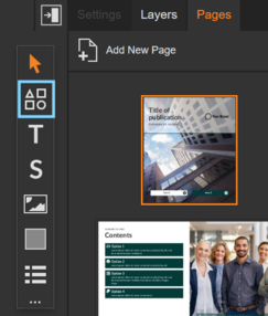
Select the 'Components' panel from the panels palette.
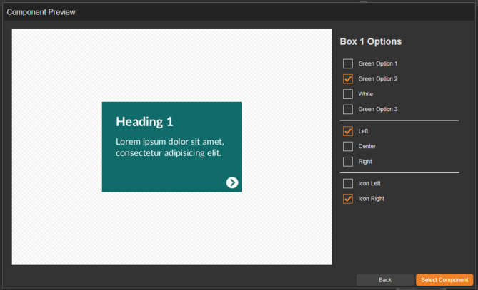
- Click a component to preview it and choose options such as colour and alignment.
-
Select 'Select Component' to confirm the choice.
-
Click and drag the component onto the page.
-
The component is added to the page, ready to customise.
Component Settings
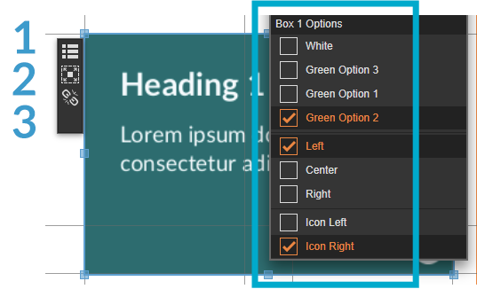
Right-click any component panel to choose a different colour from your branding, or adjust additional settings such as alignment and icon position.
Fly-out menu
Selecting a panel opens a fly-out menu with further options:
-
Edit Content
Edit the panel's content, such as text or image. -
Resize Panel to Fit Component
Resize the panel back to the component's original proportions. -
Detach Component
Convert the pre-made component into a fully editable panel.
Detaching a component removes access to its pre-configured settings, and all settings must then be managed manually. This action cannot be undone, so it's worth being certain before selecting it.
Components and Branding
Branding is applied automatically to every component added to a document, helping maintain a consistent, on-brand appearance throughout.
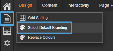
If more than one branding is available and a switch is needed, select the second icon from the left-hand menu, then 'Select Default Branding'.
Useful Tips
-
Use the filter on both the page-layout and component pickers to narrow results quickly rather than scrolling through everything available.
-
Detaching a component is permanent — if there's any chance the pre-configured settings will be needed again, duplicate the page first.
-
Switch to the correct default branding before adding components, so panels come in with the right colours from the start.