
The 'Subscribe' module (previously known as 'Join a Mailing List') lets readers subscribe to an expected visitor list directly from a document, without needing to leave the page or follow a separate link. This creates a smoother experience for readers and makes it easier to capture sign-ups, grow your mailing lists and connect people with the updates, courses or communications that matter to them.
-
Automatic course enrolment
Readers can be added straight onto a course by subscribing, removing the need for manual sign-up. -
Newsletter sign-ups
Readers can opt in to receive ongoing updates without leaving the document. -
Internal communications
Teams can use it to build distribution lists for company news, updates or announcements. -
Reduced admin
Subscriptions are captured automatically, cutting out manual list management.
1. Setting up
Prepare the Expected Visitor List
Before adding a 'Subscribe' module to a page, make sure you have an Expected Visitor List ready to use, with the 'Self-service' section completed. This could be a list for new starters, a specific team within your organisation, or any other group you want readers to be able to join.
This section explains the EVL 'Self-service' section that needs to be configured when using the 'Subscribe' module. If you need help creating an EVL, follow this link.
'Self-service' settings
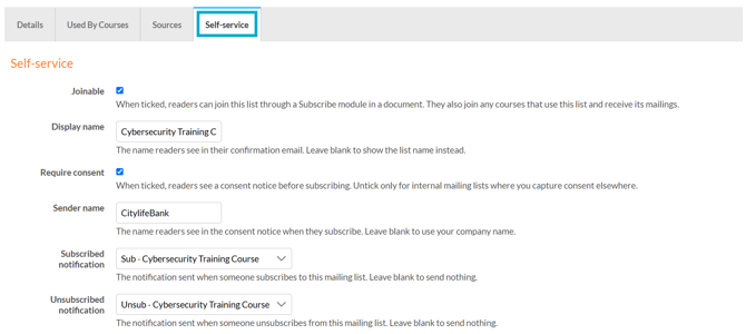
Add or edit an existing EVL, and select the 'Self-service' tab:
- Joinable
When selected, the EVL will be available as an option when adding a 'Subscribe' module. - Display name
The name shown to readers in the confirmation email they receive after joining the list. - Require consent
When selected, readers will see a consent notice before they subscribe. - Sender name
The name shown to readers in the consent notice when they subscribe. - Subscribed notification
The notification sent when someone subscribes. Leave blank to send nothing. - Unsubscribe notification
The notification sent when someone unsubscribes. Leave blank to send nothing.
-
If the 'Joinable' option is unticked, the list will no longer be available to join, even if it has already been used in a module.
- Only untick the 'Require consent' option for internal mailing lists where consent is collected elsewhere.
- If the 'Sender name' field is left blank, your company name will be used instead.
-
The 'Sources' tab will list any documents that an EVL is being used in.
- If someone chooses to join a list themselves, they can unsubscribe later. However, if they are added to a list manually, they cannot.
2. Add the module to a page
- Navigate to a document, and select 'Design' for the version you wish to work on.
- Select the ‘Interactivity’ tab at the top of the page.
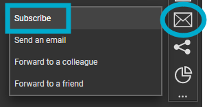
- Select the ‘Mailing' module type from the ‘Add Interactivity' palette.
- Select the 'Subscribe' module, and drag the clickable area onto the page.
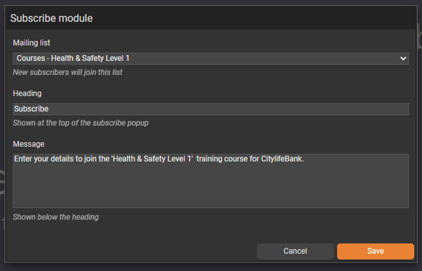
The settings for the module can then be configured to control which mailing list readers can join and how the sign-up prompt appears when they click the module:
- Mailing List
Select which EVL the reader can join. - Heading
The title shown to the reader after clicking the module, introducing what they’re signing up for. - Message
The supporting text shown alongside the heading, explaining in more detail what the reader is signing up for.
3. What the reader sees
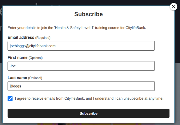
Once the module has been added, readers who view the document and select the module will be presented with a simple sign-up form containing:
- Email address
- First and Last name
- A consent checkbox (if enabled)
- A 'Subscribe' button
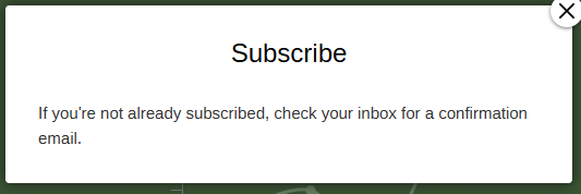
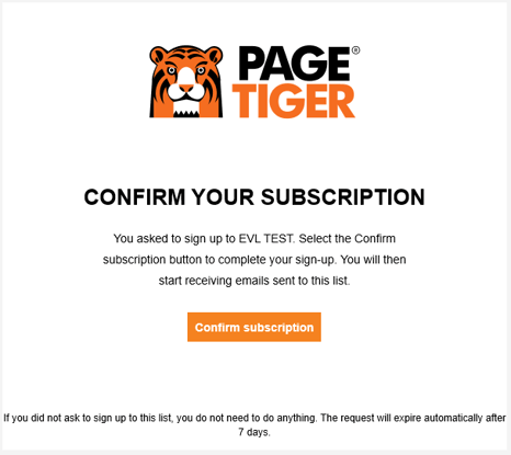
Once 'Subscribe' is clicked, the reader will see an on-screen pop-up informing them to check their inbox for a confirmation email. A confirmation email will be sent to the email address they entered.
Once the email is received, they will need to click 'Confirm Subscription' to complete their sign-up and be added to the list.
Admins can view pending sign-ups in the Expected Visitor List under 'Awaiting confirmation'. This section shows each reader's email address, first name, surname and the date they requested to subscribe.
Any unconfirmed email addresses automatically delete after 7 days.

The functionality of the 'Subscribe' module was updated on 24 August 2026. If you used this module in a document before that date, it will continue to work in the legacy way until you edit it.
4. Additional module settings
Click on a module already placed on your page to activate the Settings palette. This allows you to configure options like module description, pop-up border colour and size.
Name
The 'Name' field is set by default, but it's important to update it to something unique that reflects the interactivity - for example, 'Subscribe to H&S course', as it will be shown in the Analytics of you document.
Descriptive names make it easier to identify the interactivity in your document, which is particularly helpful if you're using lots of the same module type.
Heading
The heading is the text that will be displayed to the visitor when they view the module in your document.
Interactivity ID
Copy this token and paste it into the 'Activate Interactivity' menu item type to activate the module directly from a menu.
Description
The text entered here will display when a user hovers their cursor over a module. It is also read out by a screen reader when a document is viewed in accessible mode.
Accessibility
Focus Outline Colour
This option can be used if Accessibility has been enabled for your document, and sets the colour of the outline that displays around the piece of interactivity being viewed.
Popup Style
Border Colour
A border adds a keyline around the pop-up box - use this field to specify the colour of the border.
Border Size
Use the 'Border Size' field to specify the width of the border around the pop-up box. Enter a numerical value to set the border width - the higher the value, the thicker the border.
Back Colour
The 'Back Colour' field allows you to set a background colour for the pop-up box - select from the colour picker, enter a HEX code, or choose from your brand colours.
Margin Size
Margins create breathing space by adding a separation between the content in the pop-up box and border. Enter a numerical value to set the margin size - the higher the value, the larger the margin.
Max Width & Height
Adjust the width and height of the pop-up box. Aim for no larger than 900 to ensure the pop-up box is viewable on different monitor sides.
Disable Close
This option can be selected if you want to prevent the visitor from closing the pop-up box.
Be mindful when using this option, to avoid causing frustration to readers as it can prevent them from navigating further in your document.
Clickable Area
Position X & Y
Adjust the position of the clickable area. 'X' sets the position of the left edge and 'Y' sets the top edge.
Width & Height
Adjust the width and height of the clickable area. The size is measured in pts.
Link to Panel
Link the module to a panel in your document. Once linked, the module will move with the panel if it is repositioned or resized.