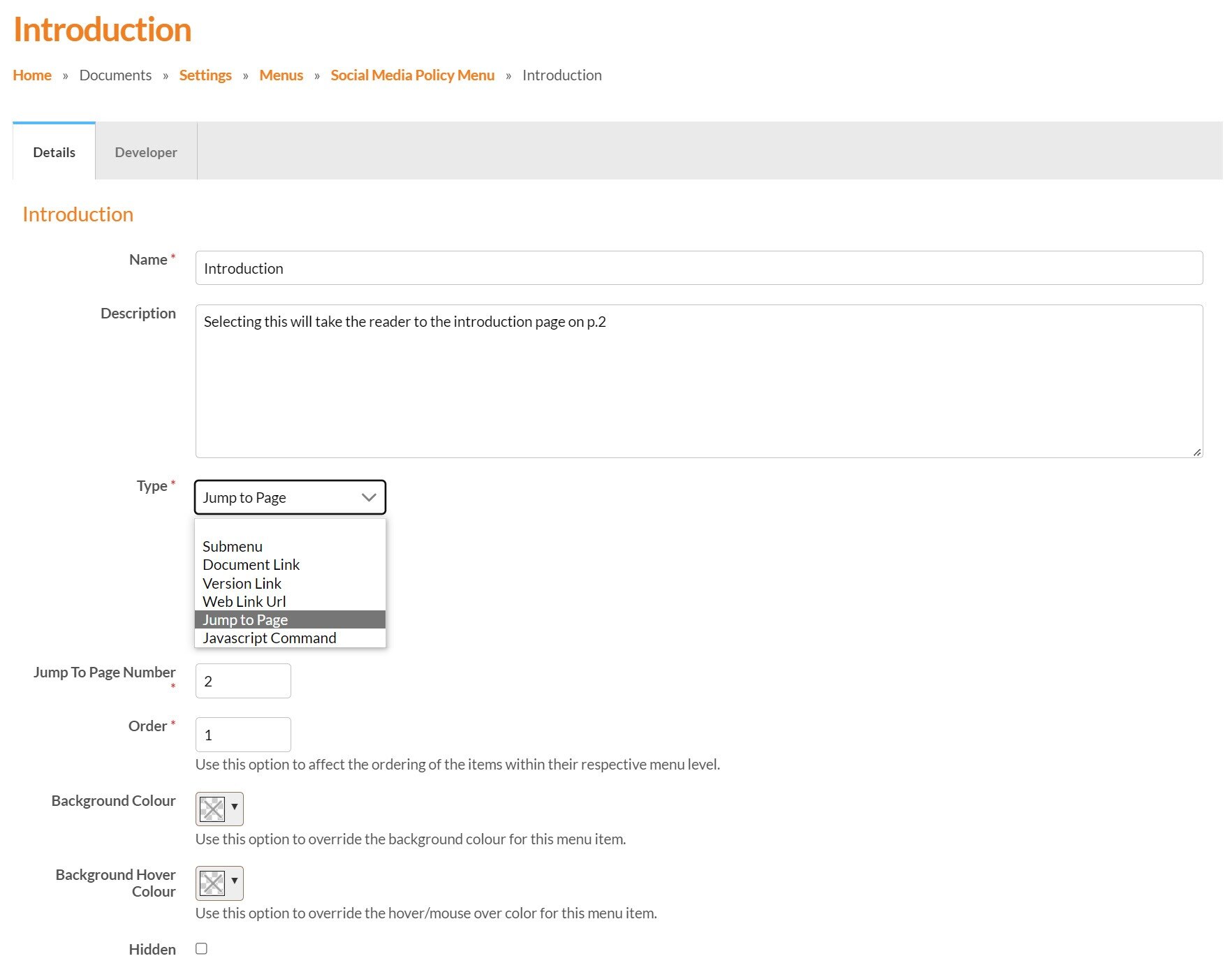
Menu items are clickable buttons within a menu that trigger actions, such as opening a web link, moving to a specific page in a document, or enabling the visitor to search the content.
Read more about menu items and their uses.
Settings
Menu Items share some of the same settings.
Name (mandatory)
Enter a name for the Menu Item, for example ‘Home’ or ‘Newsletters’. This is what will display on the Menu, so make sure it’s clear, concise and avoid using more than two to three words where possible.
Description (optional)
An optional description can be added which can be useful to explain to the admins in your account what the Menu Item will do.
Type (mandatory)
An essential option, as this is where you choose the type of Menu Item that you wish to use. Choose from Submenu, Document link, Version Link, Web Link URL, Jump to a page, Search or Activate Interactivity. Read more about Menu Items and how to add them.
Order (mandatory)
Enter a number here to specify the order of the Menu Item. For example, entering 1 will display the Menu Item as the first button on the Menu.
Background Colour (optional)
Select a colour to override the Menu background colour.
Background Hover Colour (optional)
Select a colour to override the Menu hover colour.
Hidden (optional)
Selecting the checkbox will hide the menu item from your menu.